Introduction to Color Theory
Color theory serves as the foundational framework for understanding how colors interact and influence perceptions. At its core, it comprises the color wheel, a circular arrangement of hues that illustrates the relationships between different colors. The color wheel is typically segmented into three primary categories: primary, secondary, and tertiary colors. Primary colors, which include red, blue, and yellow, cannot be created by mixing other hues. In contrast, secondary colors, formed by combining two primary colors, include green, orange, and purple. Lastly, tertiary colors result from mixing a primary color with a secondary color, yielding hues such as red-orange and blue-green.
The understanding of these classifications is essential when choosing a color palette, particularly for photo backdrops. Each color can evoke specific emotions or responses, thus influencing the overall impact of the photographic composition. Complementary colors, which are situated opposite each other on the color wheel, create a striking contrast that can draw attention to the subject of a photograph. For instance, pairing blue with orange produces a vibrant juxtaposition that enhances visual interest.
Similarly, analogous colors, which are located next to each other on the color wheel, create a harmonious and pleasing effect. This effect can be particularly useful for creating soft, inviting backdrops that do not distract from the main subject, allowing for a more serene atmosphere. Understanding the principles of color combinations, including how warm and cool colors interact, is vital for selecting an effective backdrop that complements the subject matter. Mastering these concepts will ultimately aid photographers and designers in creating stunning visuals with a well-thought-out color palette.
Understanding the Mood and Emotion of Colors
Colors play a significant role in evoking emotions and setting the mood in photography. Each color carries its unique psychological significance, influencing viewers’ perceptions and feelings. By understanding the mood associated with different colors, photographers can select the most appropriate backdrop colors to align with the themes or messages they wish to convey in their work.
Warm colors, such as red, orange, and yellow, are typically associated with energy, warmth, and excitement. These hues can create a vibrant and inviting atmosphere, making them ideal for photoshoots aiming to depict joy, celebration, or intimacy. For instance, using a warm-colored backdrop can enhance the emotional impact of family portraits or festive events, allowing the feelings of warmth and affection to come through more vividly. However, it is important for photographers to use warm colors judiciously, as an overabundance can evoke feelings of aggression or chaos.
On the other hand, cool colors like blue, green, and purple are known for their calming effects. These shades can impart a serene and peaceful ambiance, suitable for portraits, landscapes, or scenes meant to convey tranquility or introspection. A backdrop in these colors can enhance the viewer’s sense of relaxation, making it an excellent choice for wellness or meditation-focused photoshoots. Additionally, different shades and tones of these cool colors can create varying emotional effects; for example, a soft pastel blue may likely evoke a sense of calm more so than a darker navy blue.
Ultimately, selecting the ideal color palette for backdrops requires an understanding of the psychological effects colors can have on viewers. By thoughtfully considering the emotions intended for the photoshoot, photographers can create images that resonate on a deeper level with their audience, effectively conveying their desired message through color choice.
Assessing the Subject of Your Photos
When selecting a backdrop for your photographic endeavors, it is essential to analyze the colors present in the subject of your photos. The human eye naturally seeks harmony and contrast, so understanding how the colors in your subject influence the choice of your backdrop can significantly impact the overall effectiveness of the image. Whether you are photographing people, objects, or landscapes, the colors present in these subjects should largely dictate the palette chosen for the background.
For instance, when photographing people, consider their skin tones, clothing colors, and even their hair shades. Warm skin tones often harmonize well with colors like terracotta, olive green, and soft yellows, while cooler skin tones may look striking against shades of blue, purple, and grey. It is crucial to avoid colors that might blend into or clash with the subject’s features. If the clothing is too similar to the backdrop, the subject can become lost within the frame, diminishing their prominence in the composition.
Similarly, when working with objects or landscapes, analyze the inherent colors in these subjects. A vibrant flower arrangement may require a more muted background to truly stand out, whereas an intricate landscape might call for complementary colors that elevate its natural beauty without overwhelming the scene. By considering the color palette of your subjects, you can effectively create a backdrop that not only enhances but also elevates the focal point of your photography.
In selecting your backdrop’s colors, aim for a balance that highlights the subject’s features without competing for attention. This thoughtful approach ensures that your photography captures the essence of the subject while presenting it in an aesthetically pleasing manner, ultimately leading to more impactful images. By carefully assessing your subject’s colors, you can choose a backdrop that enriches the visual narrative you are aiming to convey.
Working with Lighting Conditions
Choosing the right color palette for your photo backdrops is significantly influenced by the lighting conditions under which the photographs will be taken. Lighting can dramatically alter the appearance of colors, hence understanding its effect is crucial. Natural lighting, for instance, tends to enhance colors, providing a more vibrant and realistic representation. In outdoor shoots, colors can appear more saturated during golden hour, the period shortly after sunrise or before sunset when the sunlight is softer and warmer. Thus, selecting a color palette that complements this warmth, such as earthy tones or pastels, can create aesthetically pleasing results.
Conversely, artificial lighting, such as fluorescent or tungsten bulbs, can produce a different color temperature that may dull or distort colors. For studio environments, it’s imperative to consider the type of artificial lighting in use. Tungsten lighting emits a warm hue, favoring richer and warmer tones like reds and oranges in the color palette. On the other hand, fluorescent lighting tends to cast a cooler tone, which might require incorporating colors with cooler undertones or those that maintain their integrity under such a hue.
Moreover, accounting for shadows and highlights is imperative when working with both natural and artificial light. Colors can shift dramatically depending on the intensity and angle of light, causing certain shades to appear differently than intended. To ensure that your selected color palette remains effective, conducting tests or using color swatches in your planned lighting environment is advisable. By doing so, photographers can predict color outcomes and make informed choices to enhance the overall visual impact. Ultimately, adapting your color palette according to lighting conditions can substantially elevate your photography, ensuring that colors resonate with the intended mood and message.
Choosing a Color Palette for Specific Themes
Selecting the ideal color palette for your photo backdrops plays a critical role in enhancing the overall visual impact of your images. When aligning colors with specific themes or occasions, it is essential to consider the emotional response that different hues elicit. For instance, weddings typically call for soft, romantic shades such as blush pinks, pastel blues, and creamy whites. These colors create a serene and elegant atmosphere, which complements the joyous occasion. A color palette that favors soft shades can significantly enhance the ethereal quality of wedding photography.
In the realm of fashion photography, bold and striking color combinations tend to dominate. To create a fashion-forward backdrop, consider using vibrant colors such as electric blue, deep red, or even neon shades. These colors not only capture attention but also showcase the garments being photographed effectively. A successful palette may involve pairing contrasting colors to highlight textures and patterns in the clothing, ensuring a sharp visual distinction.
For product photography, the color palette should be chosen to emphasize the product’s characteristics while maintaining a cohesive aesthetic. Neutral colors like grays or whites often serve as the foundation, allowing products to stand out without distraction. A pop of color related to the product itself can enhance visual interest, while maintaining the overall harmony of the composition. For example, a green backdrop can work well for organic products, evoking a sense of nature and freshness.
When selecting a color palette for any theme, strive for visual coherence. This can be achieved by ensuring that colors complement each other and reflect the overall mood appropriate for the occasion. Utilizing color psychology can guide the choice of your backdrops, whether it’s for a romantic wedding, edgy fashion shoot, or clean product showcase. Understanding the context is an invaluable aspect of creating a compelling visual narrative.
Incorporating Trends and Seasonal Colors
The world of photography is ever-evolving, and one of the key elements that can enhance a photograph is the choice of backdrop colors. To remain relevant and captivating, photographers must pay attention to current color trends and the impact of seasonal hues on their work. This not only elevates the overall aesthetic but also ensures that the photography aligns with contemporary styles and themes.
Currently, various color palettes dominate the photography landscape. For instance, soft pastels have gained popularity for their calming effect, making them ideal for portrait photography. At the same time, rich and bold shades such as deep reds or royal blues can add drama and intensity to the imagery. These trending colors allow photographers to convey different emotions and narratives, critically influencing the visual storytelling experience. Staying in tune with such trends enables photographers to select backdrops that enhance their subjects, providing a cohesive visual narrative.
Additionally, seasonal colors play a vital role in backdrop selection. Each season brings a unique palette that can transform the mood of the photographs. In spring, light greens, soft yellows, and blush pinks evoke freshness and renewal. Summer’s vibrant and lively hues, such as bright oranges and vivid blues, can energize a scene, capturing the essence of warmth and joy. Autumn’s earthy tones—rich browns, burnt oranges, and deep reds—render classic backdrops that evoke a sense of nostalgia. Conversely, winter offers a serene view with cool tones like icy blues and crisp whites that can create a tranquil atmosphere.
In exploring these current color trends and seasonal palettes, photographers can enhance their work, creating backdrops that not only complement their subjects but also resonate with their audience. Utilizing these insights allows photography to reflect both contemporary culture and nature’s cyclical beauty, ultimately enhancing visual storytelling capabilities.
Practical Tools for Color Palette Selection
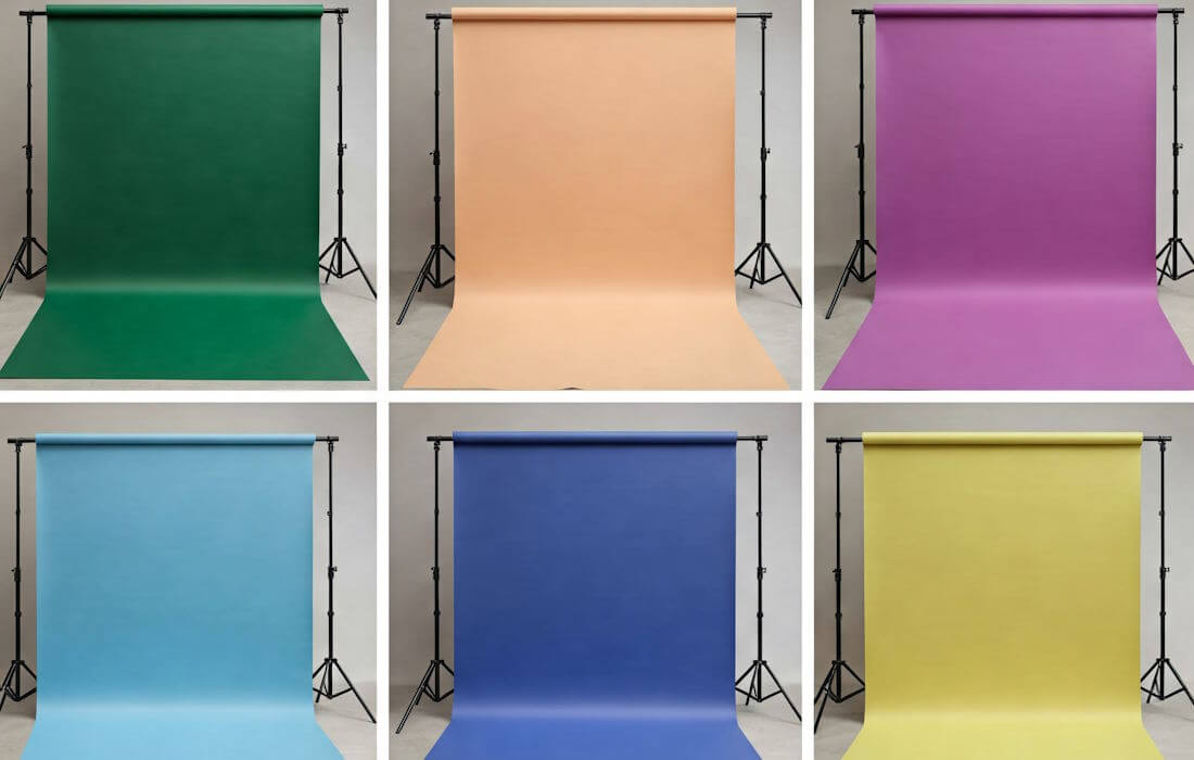
Selecting the right color palette for photo backdrops is essential for enhancing the visual appeal of any photography project. Fortunately, there are various practical tools and applications available that can assist photographers in this endeavor. These resources simplify the process of exploring, harmonizing, and selecting colors that best suit a particular theme or mood.
One popular tool is the digital color wheel. This interactive tool allows users to visualize color relationships, such as complementary, analogous, and triadic schemes. By using a color wheel, photographers can easily identify ways to combine colors harmoniously, ensuring their backdrops enhance the subject without overwhelming the visual narrative.
Another helpful resource is online palette generators. Websites like Canva or Adobe Color offer users the ability to create color palettes based on a single chosen color. By inputting a base color, these tools will auto-generate complementing shades, tints, and tones that work well together. This feature is particularly useful for photographers seeking to develop cohesive and visually appealing artworks.
Additionally, mobile apps have revolutionized the process of color palette selection by allowing users to explore colors on-the-go. Applications like ColorSnap, by Sherwin-Williams, enable users to capture colors from their environment using their smartphone’s camera. The app then provides the exact shades alongside complementary colors, which can guide photographers when choosing backdrops that align with their vision.
Finally, utilizing design tools such as Adobe Photoshop or Lightroom can also aid in palette selection. These programs offer color sampling tools that help photographers analyze existing images for dominant hues, enabling an accurate match for backdrops. With these practical tools, photographers can easily navigate the complex world of color harmonization, leading to stunning and immersive photography.
Testing Your Chosen Palette
Once you have selected a color palette for your photo backdrops, it is essential to evaluate its effectiveness through practical testing. This process helps determine how well the colors interact with each other, the subjects being photographed, and the overall lighting conditions. A systematic approach to testing will ensure that the colors not only look good on paper but also translate well into captivating images.
Begin by creating test shots using the selected color palette. Set up the backdrop with the chosen colors and arrange your subject in front of it. It is advisable to experiment with various lighting conditions, as natural and artificial lights can significantly affect color perception. For instance, warm light can enhance reds and yellows, while cool light may emphasize blues and greens. Make sure to take multiple shots from different angles to capture a comprehensive view of how the palette performs.
Once you have completed your test shots, it is crucial to review the images thoroughly. Assess them on both screen and print formats, as color display can vary across different mediums. Pay close attention to the harmony of the colors; do they complement each other well? Are there any colors that clash or appear overly saturated? Additionally, consider how the chosen palette affects the visual narrative of the images. A good color palette should not only enhance the aesthetics but also contribute positively to the overall mood and story being conveyed.
Based on your initial results, make adjustments to the color selections as needed. Sometimes, slight modifications can yield significantly better outcomes. Don’t hesitate to revisit the palette and incorporate alternative shades or variations until you achieve the desired effect. This iterative process is essential for making sure that your color choices elevate your photographic work and fulfill your creative vision.
Conclusion: Final Thoughts on Color Palette Choices
Choosing the perfect color palette for your photo backdrops is a crucial step in enhancing the overall quality of your images. Throughout this discussion, we have examined the significance of color theory, the psychological effects of colors, and practical tips for selecting harmonious hues that complement your subjects. It is essential to consider these elements while also being mindful of the creative aspects of your photography.
When selecting a color palette, make sure to take into account the emotions that different colors evoke. For instance, warm tones like reds and yellows can create a sense of energy and excitement, while cool colors such as blues and greens often promote calmness and tranquility. Understanding the emotional impact of colors will enable you to convey specific moods in your photos, making your work more powerful and engaging.
Another important aspect to consider is the relationship between colors. Utilizing contrasting colors can create a vibrant backdrop that draws attention, while analogous colors encourage a more cohesive and subdued aesthetic. Experimentation is key in this process; it can lead to interesting combinations that may not be immediately apparent. Additionally, considering the lighting conditions and the characteristics of your subject will further inform your color choices.
A well-chosen color palette does more than merely enhance the visuals; it holds the potential to tell a story and evoke certain feelings that resonate with viewers. In conclusion, remember to blend creativity with a solid understanding of color principles. By doing so, you will be more equipped to create stunning photo backdrops that elevate your photography to the next level.